In a couple weeks, seven of my female classmates and I are hitting up the Big Apple for the
Advertising Women of New York (AWNY) Career Conference. All of us who are going are a part of our campus advertising agency, Kwerkworks, a student chapter of the
American Advertising Federation (AAF).
Because this is an important opportunity to network and because I am the Chief Designer for AAF, I have offered to help each of my team members with making personalized business cards. I want each person's cards to reflect who they are as a professional. To do this I am planning on meeting one-on-one with those who want cards to get an idea of their strongest assets and design preferences.
Some suggestions for making business cards both professional & creative:
Dynamic Visuals
Believe it or not, most business cards do not have images. I don't think trading in creativity for simplicity is the right choice in this competitive job market-- particularly in advertising, a field that survives off of innovation. Don't just say who you are. Show it. An option is having a portrait of yourself on your card so that the person who receives it can remember who you are when they look at it.
Orientation
Traditional business cards are horizontally orientated. Try to stand out by having a vertical orientation.
Shape
 Who says you have to make your card a rectangle? What about a square, or a circle? In fact, rules are made to be broken, so the rebels say.
Color Pallet
Like every well designed piece, consider your color wheel. Color schemes should try to be monochromatic (one color), Triad (colors opposite by thirds), Complementary (colors opposite), Compound (colors opposite and shades) and Shades (same color with variations). I use the color wheel on Adobe Color CC to generate exact color formulas for my design pallets.
Black Background
When everyone else has white business cards, throw in a black one. Reverse type can be particularly dynamic and modern looking. Whatever you choose for your background make sure it is not too distracting and make sure the words are readable. Legibility is the most important thing.
Embossing
Embossing involves raising the lettering on a card to give it a 3D effect. While it can be a bit more expensive than normal printing, it makes a card more durable and sophisticated.
Bleed
You don't want a border on your cards. It just looks tacky. Make sure to have a bleed so that the color goes all the way to the edges. This is easy to adjust by making the color go past the margins. The printer can then trim it so the color fills the whole intended area.
Material
Consider the durability of the card. How thick do you want the paper? Out of what material? Do you want a glossy look? Some people don't even use paper. They use leather, metal or plastic.
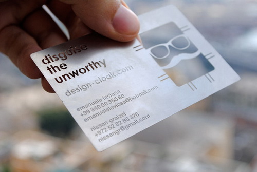
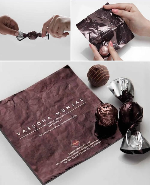
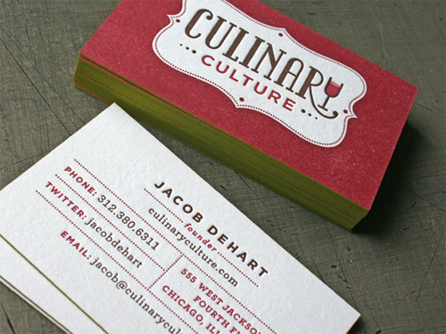
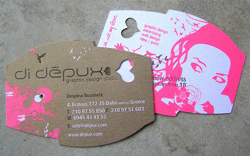
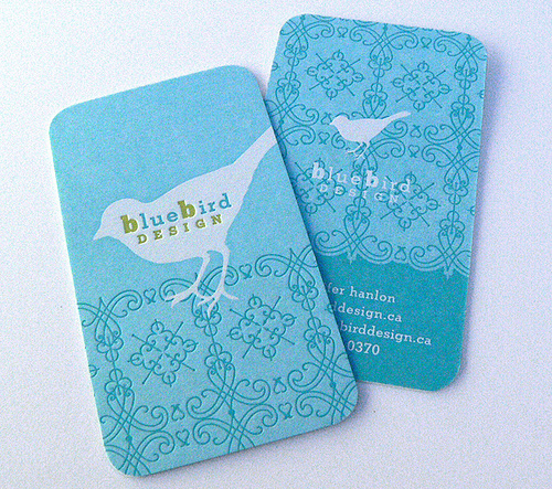
Here's some cards that I came across that are out-of-the-box. Let's get funky!
Because of time and cost we probably will do simpler cards than the funky examples. The examples show that there is no limit to creativity when it comes to business cards. A clear, creative plan will help make cards worth remembering you by. It is also ok to try out different cards to see what works best for where you are at in life.
I will post pictures of some finished cards, including my own, in an upcoming post.
Cheers!
Laura


No comments:
Post a Comment